When we talk about Google, nothing is what it seems. The company has grown a lot and is far from that simple search engine that began its adventures in the Internet world back in 1998. Now the company is much more than a simple search engine, the company innovates with impressive projects such as Google Glass, Project Loon, Project Ara, Google Car, Android etc ...
The company is now part of a new company named A under the same creators of Google, Larry Page and Sergey Brin. This has been quite a revolution in the company and has caused a metamorphosis inside and outside of Google. Well, it seems that these are times of change in Mountain View and therefore today, Google launches new logo.
Google announced today on its official blog that it will have a new logo. The reason for the update wants to reflect the change that the company has changed in the last 17 years of existence. What was initially a service created to be only accessible through a web version, we see how today it has evolved to become accessible on all types of devices and screens.
In addition, the company has evolved from being a web version where you were looking for something and quickly had the answer, to going on to create services that we use today, such as GMail, Google Maps, until today, where we now see that Google anticipates to what we are looking for and gives us the answer thanks to the named Google Now. We must also name key products that have made Google grow in recent years, such as the Google Chrome browser or the operating system for mobile devices, Android.
New logo, new evolution

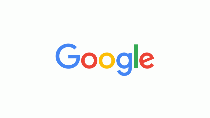
As you can see in the GIF above, the new logo is designed to reflect this evolution of the company over the years. You can see in the video that heads this article the evolution of the company, where they comment that even the name Google has become a verb. If you take a quick look at the desktop version, you will see how the previous Google logo is erased to make way for the new logo, a more colorful logo but following the minimalism that it had until now.
This is the new Google logo, so start getting used to seeing it since, both in the web version and in the applications for mobile devices, it will be well visible. And to you, What do you think of this new logo ? You like ?
lol
I like it!!