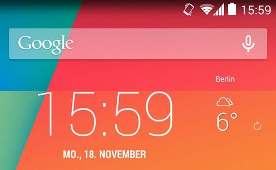
One of the most palpable differences in Android 4.4 compared to previous versions, is the change in the color of the icons that appear in the notification bar from blue to white, that anyone who has KitKat installed can quickly observe.
Apart from the convergence in the design of the colors of the notification bar with the navigation keys that we can find at the bottom of the terminal, there have been two compelling reasons why it was finally decided this change.
In previous versions, the blue color was used to indicate the status of the battery, the Wi-Fi connection or the internet data, if the connection was lost, for example, when we were connected to a Wi-Fi network , the color changed to a grayish color.
According to Google developer Dan Sandler, there were two reasons for the color change in Android 4.4. In a comment posted on your Google+, you said that the icons in blue they did not fit well with the existing transparencies in the last update. Besides, most Android users didn't really know the purpose of the different colors, blue and gray, that the status of the icons represented.
Another change that has been seen in Android 4.4 are the small arrows that indicate when the data is being sent or received, which with KitKat, only displayed in Quick Settings and has disappeared from the notification bar. Sandler has also indicated that the representation of the arrows had some effect than another on the CPU and GPU, although it had a minimal impact, they have eliminated it.
As we know, this change in the design of the blank icons in Android 4.4 is made by those owners of Android 4.4 in any of the Nexus devices that have been updated, and we will have to waitso that other manufacturers update their terminals to see how it will affect your own customization layers.
Learn more – Big Google Search update brings some KitKat features to older devices

If the notification bar is to notify. Why do you have to enter the quick settings to notify me if the connection is going well? And if I do not enter while the connection is not going well? I do not get it…
Two steps forward and one step back.
Thanks Google. Ironic Mode Off.
A good design is one that allows you to combine functionality with visual appeal. Eliminating functionality for "design reasons" is an euphemistic way of acknowledging that the design is lacking.
Bad we go if we start to remove functionalities so that it "looks nice". Many have been those who have started like this, and today they are not even remembered.
I loved the color change, you could tell if you were only connected to the Wi-Fi or also to the Internet at a glance, what they should do is white and translucent, white if there is Internet and translucent if you are connected.
I have changed the colors of some less wifi and mobile network. And if what is a bad decision because I never know when I am really connected. I'll wait until they change it. Greetings. Although they have made me want to go back to 4.3 until they fix this. How would I come back taking see that I have a backup and it would be from android 4.4 to 4.3? That is, which wipe ???
From the beginning, Android seemed "horrible" to me, and "lousy", now that at once it was working well and they had managed to attract me and feel really comfortable, they start to hurt it in useful things and as Jesus said Jimenez, functionality, design and performance must always go hand in hand, otherwise, we are going astray! ... it reminds me of my first feelings towards android ...