
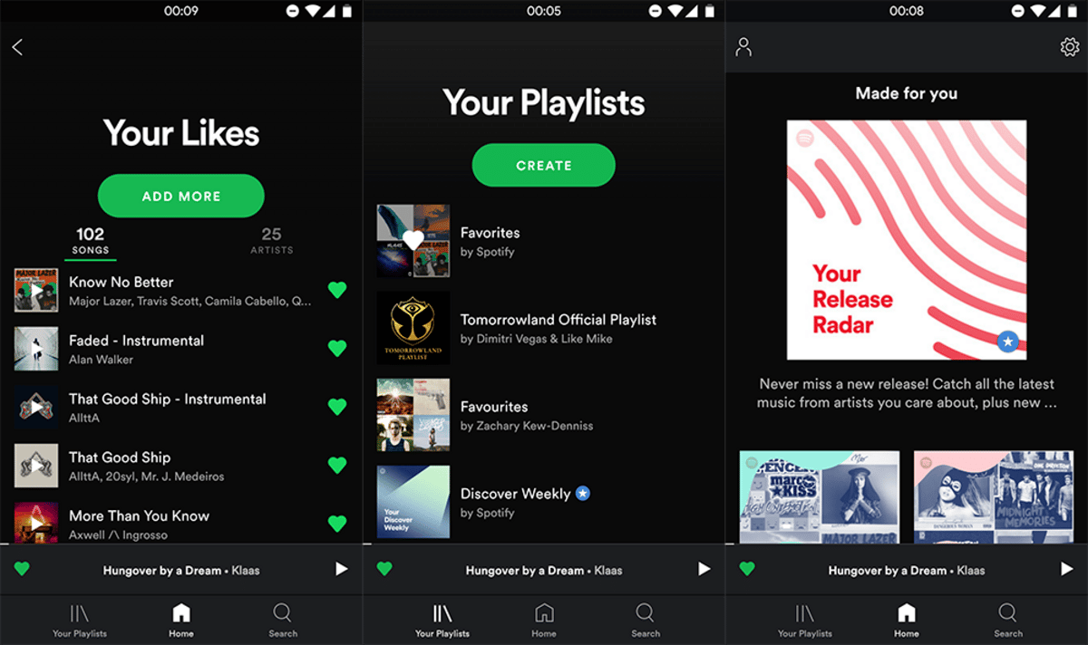
Recently Spotify he changed part of the design of his app again for Android at scrap that navigation pane side and put all its elements in some tabs located at the bottom of the screen. In this way everything is at hand from a few short keystrokes.
Now it seems that you have had a few touches on the layout to playback screen of a song so that the album cover goes full screen, when previously it stayed in a mere 1 × 1 square that took center stage. This novelty goes hand in hand with many other apps for audio reproduction in which we can see our favorite artist in all its dimensions.
These tests are being seen by some users, so it may happen that it is nothing more than an experiment and they finally back down.
The design itself is just to use the artist or album art in full so that occupy all available space. When you press on the screen, the controls are hidden, leaving nothing more than the reproduction progress bar with a predominant color linked to the visual art of the cover itself.
Have buttons located differently so that the one of sharing now replaces the one of putting the song in queue in the upper right part, while those of repeating and mixing have disappeared completely.
In general terms, the look is now cleaner than before and puts the artist or band as the visual protagonist of all the songs that are being played. A very special way to show what music is playing and not stay in that mere square that looked more like a copy of the disc on screen.
The screen looks monstrous!
: )
My husband and I have the same phone and the same version of Spotify, even the same Spotify account, but he still does not see the new version with full screen, is there a way to have it?
I have installed many versions to go back to that one, but I can't find it, what version is it? 🙁