The 'Splash screens' are the welcome screens that we can find in certain apps and that have an aesthetic objective apart from giving the application a few seconds to load all the UI elements. These welcome screens or 'Splash screens' at the time were rejected by Google itself, excusing itself that the developers had to put all the meat on the grill so that the application was well developed enough to launch and work properly.
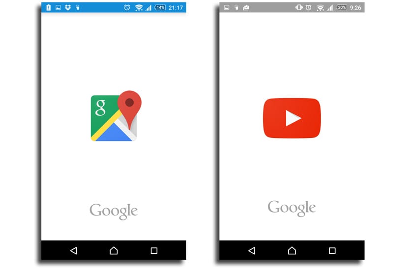
Now we can find such a screen in Google Maps, the first Google app that has been commissioned to receive this new functionality for a few days now, in order to give it a few seconds to load the application and in the next it can appear properly and the user begins to use it. Some splash screens that we have seen for some time in apps like Snapchat and that could now be a standard for a lot of apps, since we know how Google apps usually have, then it begins to move to other apps from third parties. The doubt we have is that, while this welcome screen is perfect for certain apps that take seconds to load, for others that load immediately, its use would be unnecessary.
An aesthetic measure
Facebook for Android is another of the apps that use this splash screen so that in the background it loads all that heavy interface. This welcome screen hides the user from seeing how the different elements are loading of the UI, which aesthetically can be a plausible excuse for certain apps.

But it is that for others it would be a counterproductive measure Why do you have to add a splash screen to an app that loads immediately and is efficiently developed? In these applications it could give the sensation of a slow load when the reality is different.
YouTube is one of those apps that does not load as we would like, although it does not reach the levels of Facebook, so you can see for yourself how the logo appears while in the background it loads until it is ready.
A trend from Google?
The funny thing is that Google itself a few years ago almost as if it was the "anger" at developers that they used these splash screens to hide the lack of performance of the app or that it was not polished enough to launch in a second.
Another of the possible alternatives for which the welcome screen can offer you the feeling of a slow loading of the application is that a progress bar will be launched indicating the time remaining to have the application ready, instead of that brand logo that we will have for a few seconds.

A decision made now by Google and that we will surely start to look at the rest of their apps in order to also give more importance to the brand and the entity of each of its excellent applications. Returning to reiterate the same, for slow loading apps, excellent appearance but for fast ones, we hope that third-party developers think about it and continue to show how they have created a perfect app in terms of performance.
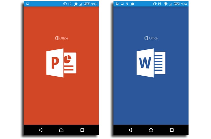
It is also curious that precisely the Microsoft apps, like the three Office ones, have these welcome screens, so Google has suddenly opted for them to give it more entity and presence to yours. Coincidence? Be that as it may, it seems that the splash screens are going to be with us for a while, so get ready for their arrival in your favorite apps.
