
Although Windows Phone has been a failure for Microsoft, for a few years, and thanks to Nadella, the truth is that Microsoft has managed to resurface to adapt to the times and even now show us the way to a new horizon where apps really adapt in such a way that we are more productive.
It is what it shows in a video and what is in itself the new Office app that includes all its most popular office automation apps, but focused on those actions that we usually do with Spreadsheets, Word or Powerpoint. A great initiative that goes along with the best design in a mobile app and well taken by the hand of productivity.
Taking the spirit of Windows Phone
Windows Phone was a failure, clearly speaking, but Microsoft wants to capture part of the spirit that it wanted to bring to mobile phones in which each app could "communicate" with the other in a totally infinite way and content to flow from one to the other. That is, there were no barriers.
And even if Windows Phone didn't work, it did Microsoft is determined that this idea be taken to the great catalog of apps that you currently have on Android. That idea today is called the Fluent Design System and it has led to its Office apps.
A set of principles that raise productivity and design at higher levels so that the two add a more than excellent experience. Fluent Design System is not a fence that third parties cannot approach, but on the contrary, Microsoft already has a series of packages listed so that other apps can join that system that combines productivity and design wonderfully.
Fluent Design by Nadella
The objective of this new understanding of what is "mobile" in an app is that users can be in their favorite third-party apps and can revert to Office apps from Microsoft so content flows like a mountain river.
Everything comes from the years of research that Microsoft has spent in different markets such as Europe, China or America. More than 40 designers and researchers have collaborated with Microsoft to collaborate on the redesign and put a big twist on the why of applications and how they can improve productivity.
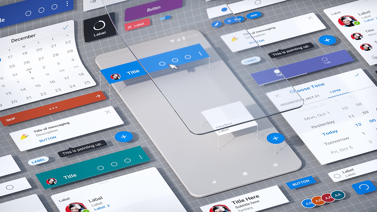
In depth, the idea grows from the connection between all the apps and building a common design system to make Fluent a mobile-first design system. If we already had Material Design to improve Android apps with that design language devised by Google, Fluent wants to go further so that those apps connect with the rest. It is very clear that socializing and communicating between people and companies is a common good that Fluent wants to promote.
Fluent as a link between Microsoft, Samsung and Google

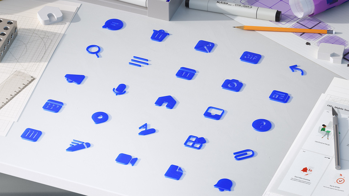
We can go to Outlook in recent months to see how the iconography has been improved, the identical file lists, the updated typography, those "splash" screens, and the focus on that dark mode we've seen in a large number of applications.
If we go to Word, Excel, Outloo, OneDrive and PowerPoint, they all share that same design of the elements and they are familiar to us. We find a header with bright colors in each of these apps to be able to differentiate them quickly and a bottom bar that incorporates and endorses the new designs of the Fluent icons.
And one thing must be made very clear, Fluent is not intended to be a single app design and productivity language for both iOS and Android, but it adapts according to the vicissitudes of each operating system. We can end up taking one of Friedman's phrases from Microsoft:
If we have been observing the rivalry that has existed between these brands, now the barriers and limits are disappearing to see them collaborate on Android. With that direct communication, designers are expected to improve Microsoft's experiences, how Microsoft helps improve Samsung's, and how everyone improves Android in its most global aspect.
Now we have follow the evolution of these brands and as Fluent It will be a link between them to improve design experiences and productivity when spending those 4 hours on average with which each user produces for their personal or professional life.